New Balance
Elevating Branding With Timeless Packaging & Innovative Product Expansion
Objective
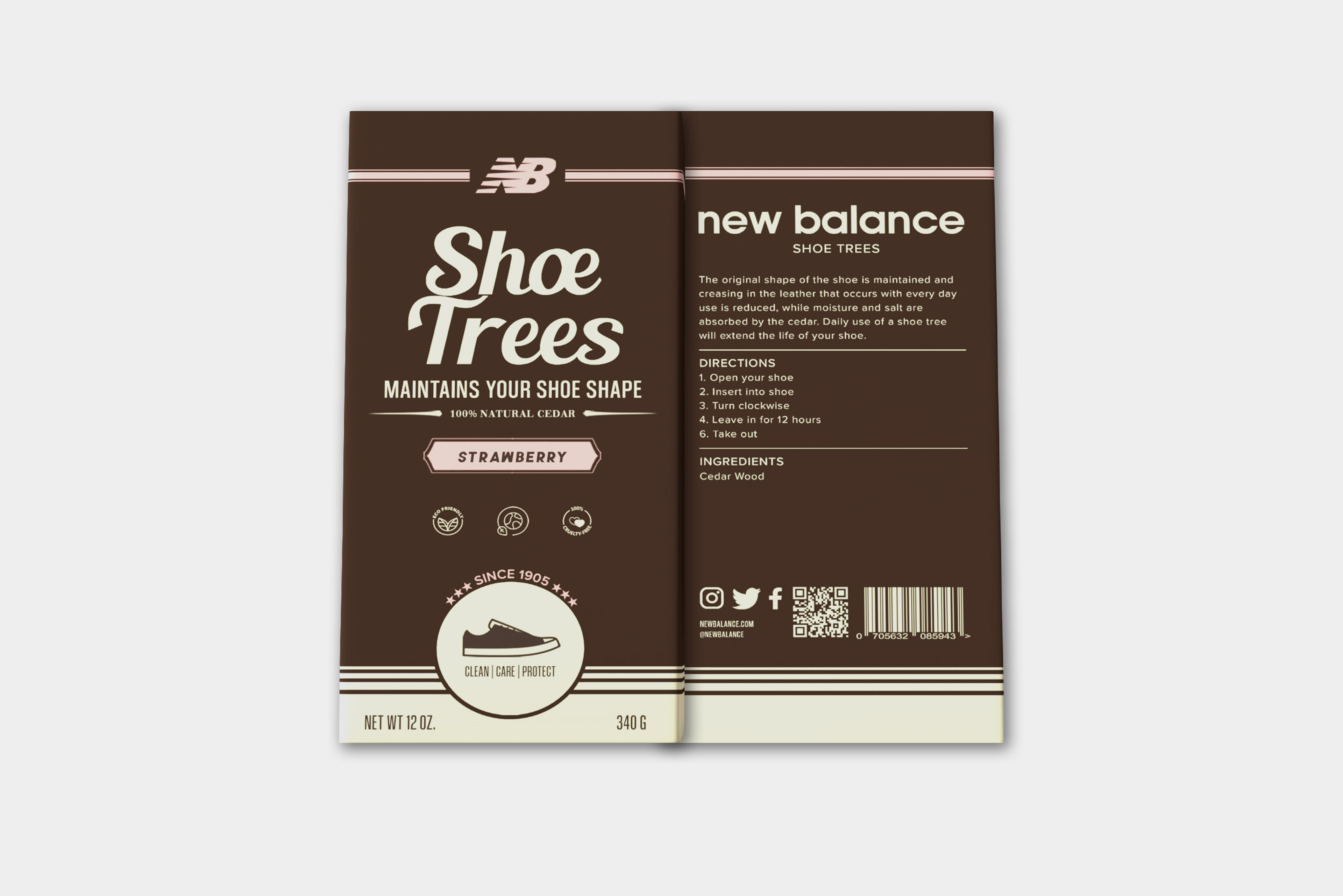
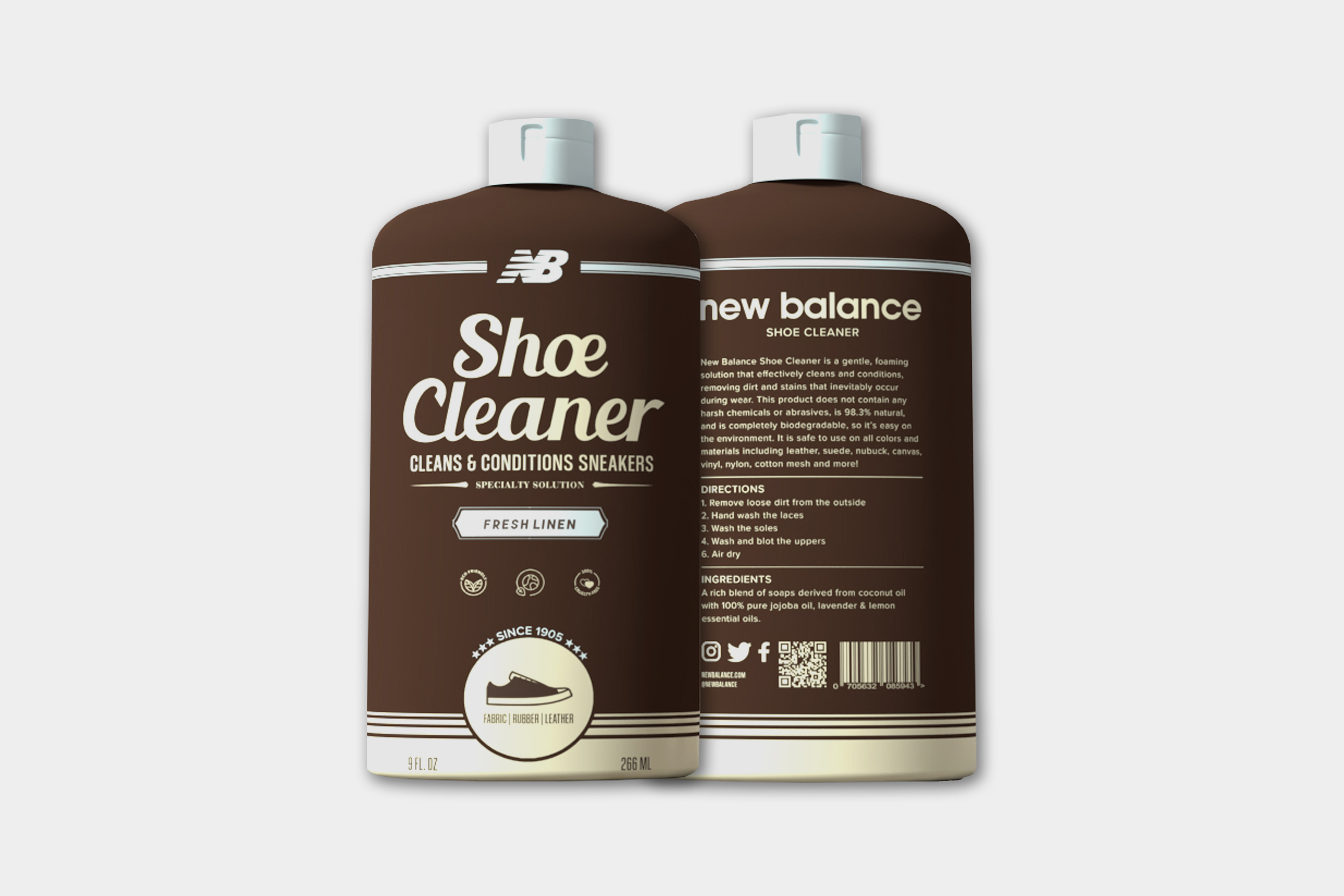
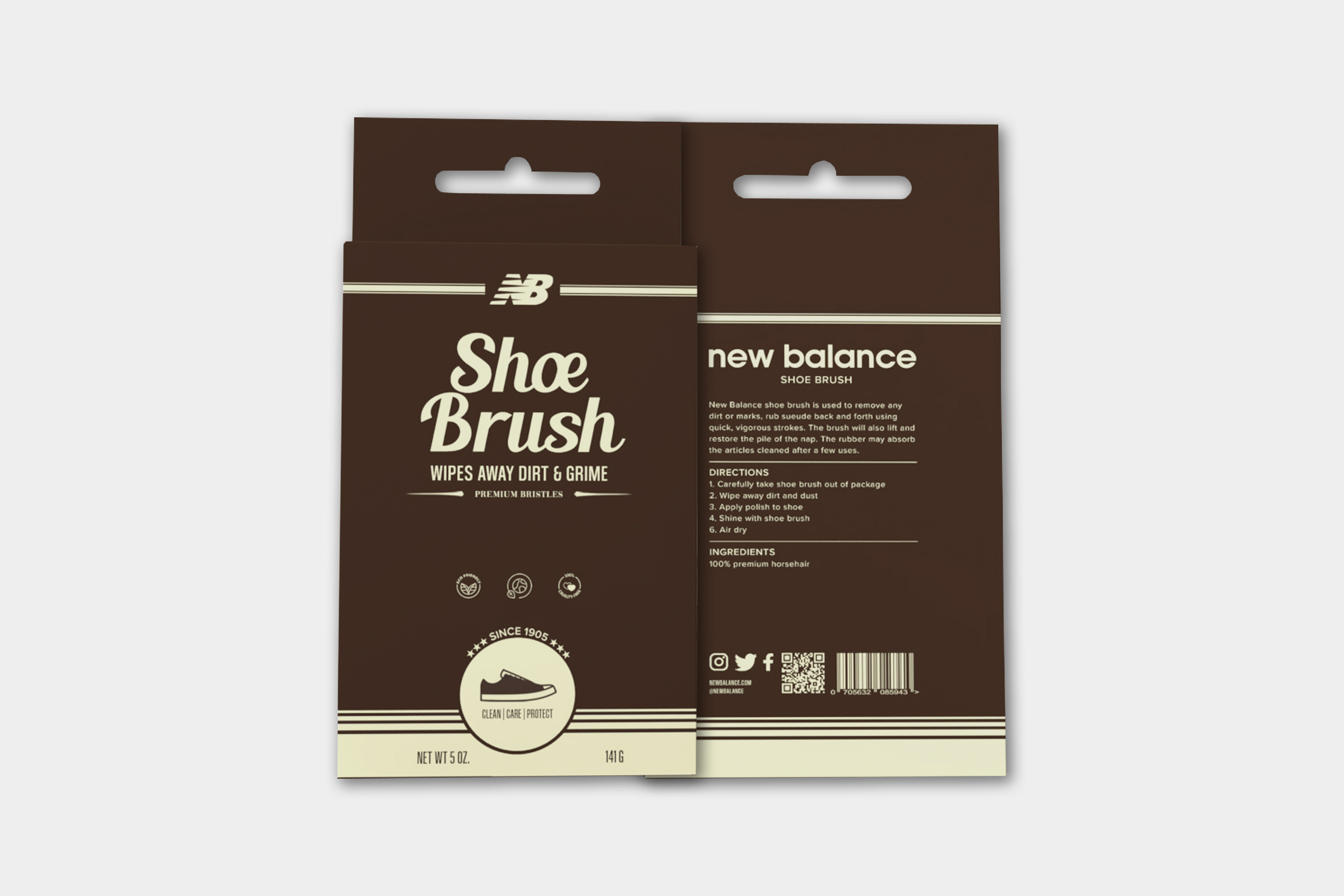
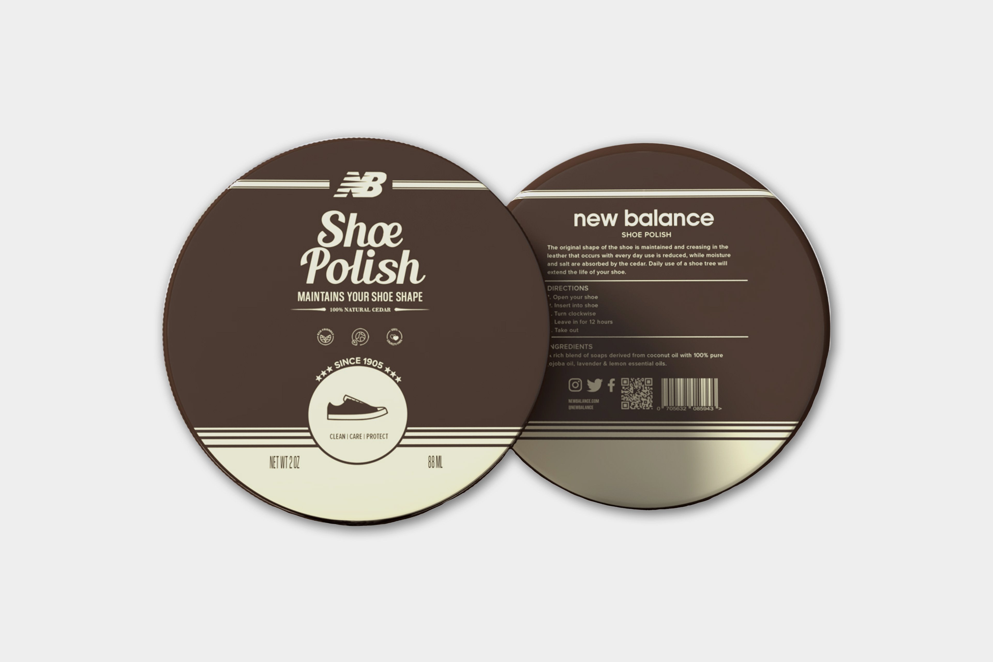
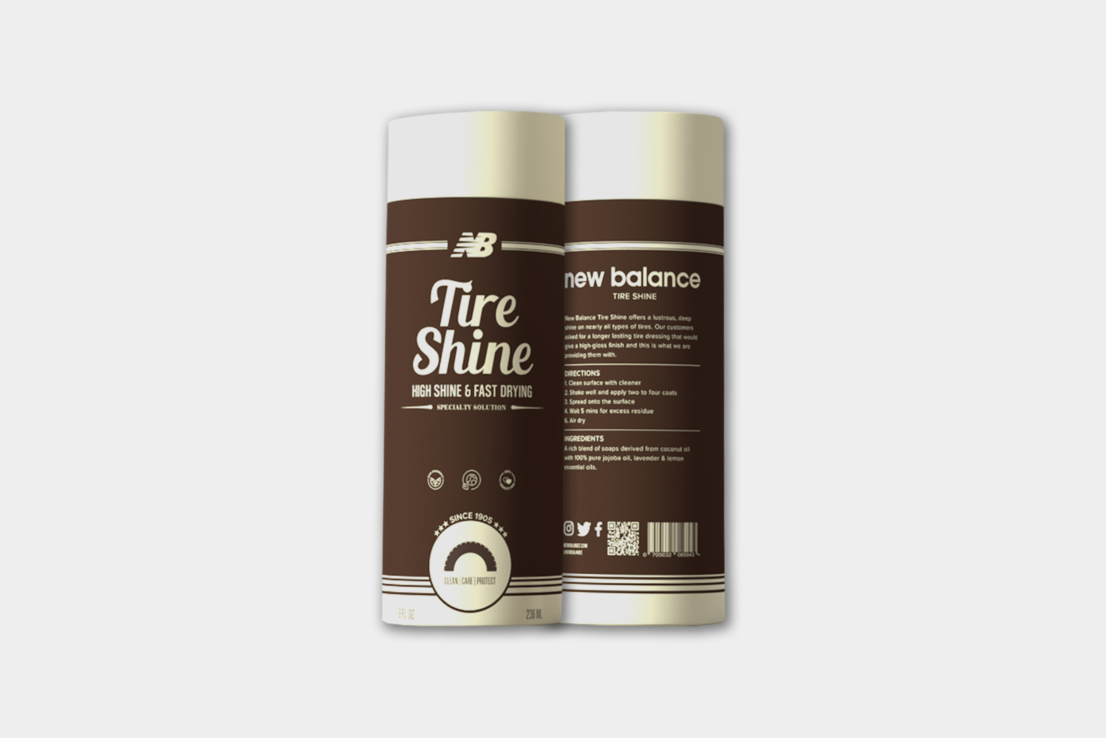
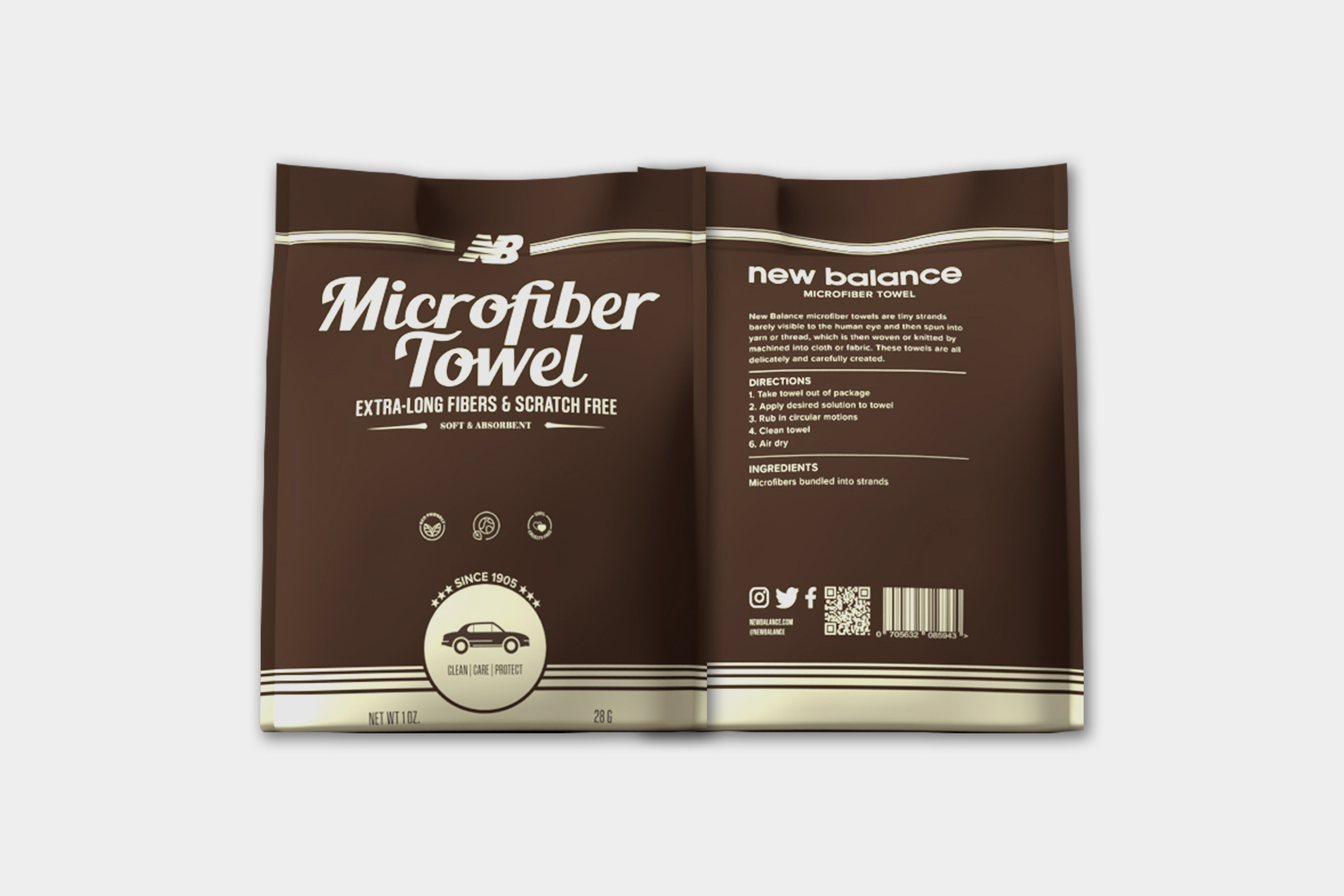
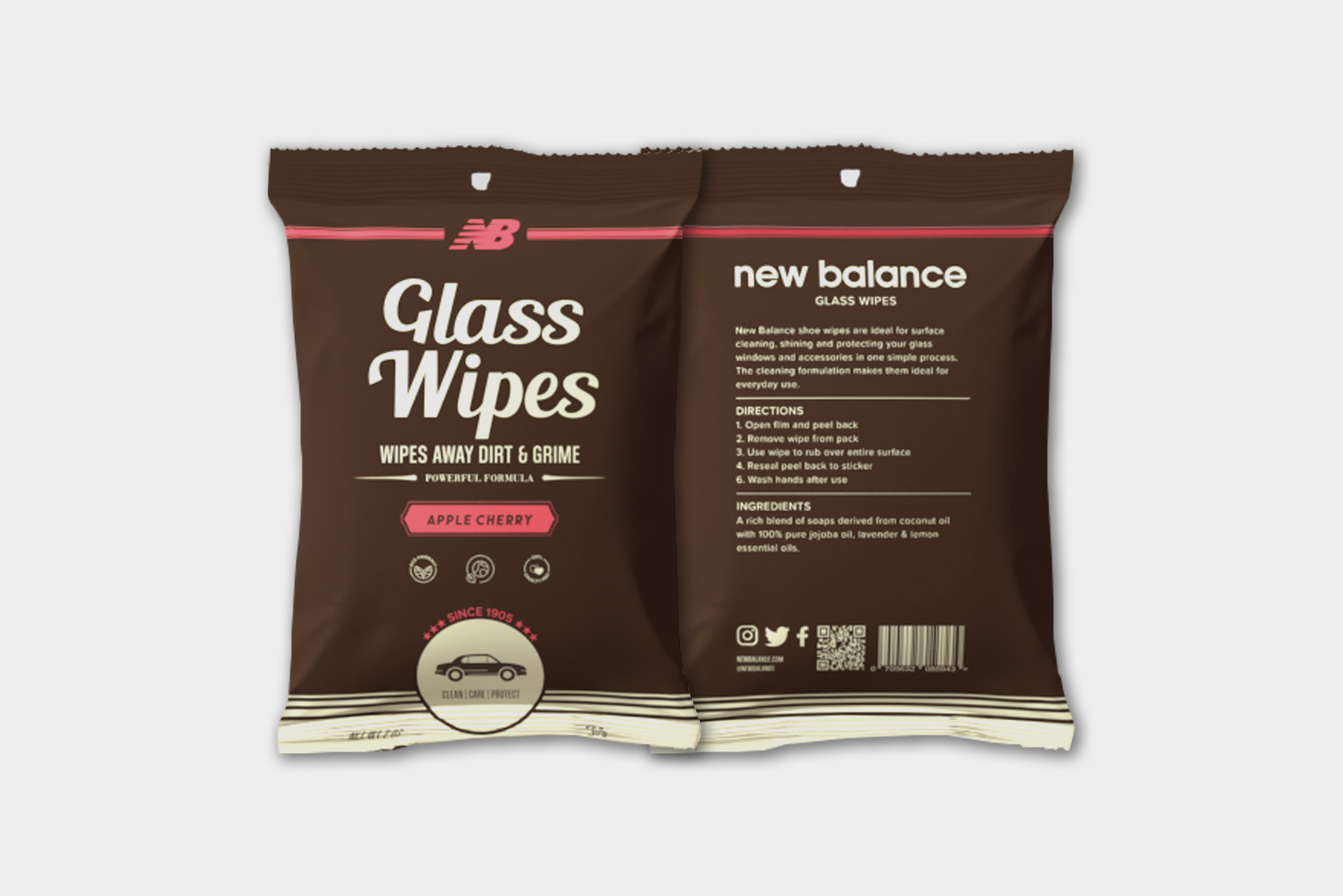
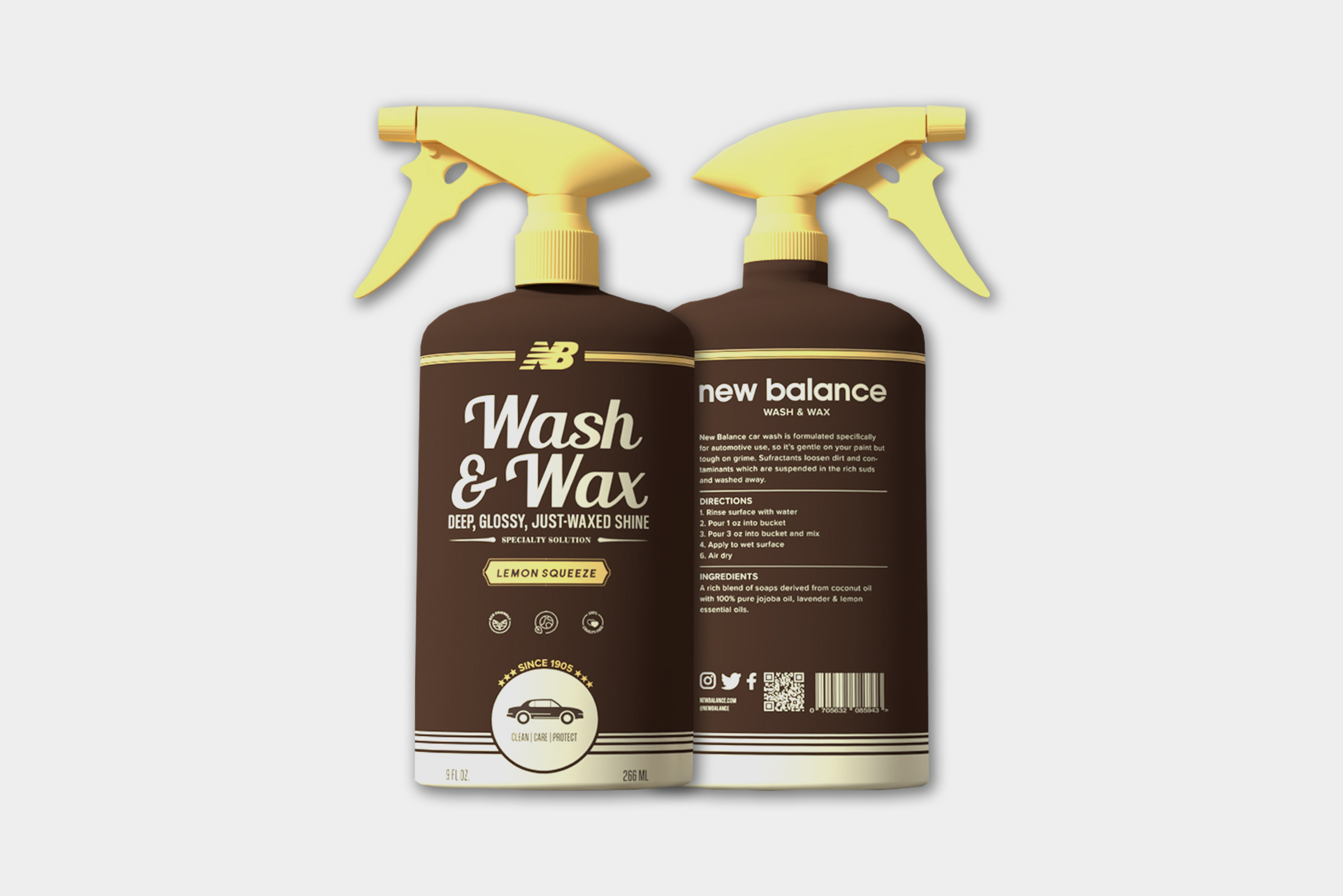
To blend classic design elements with modern brand expansion, through the creation of vintage-inspired packaging for New Balance and the strategic introduction of a new car care product line, enhancing the brand's identity and market reach.
To blend classic design elements with modern brand expansion, through the creation of vintage-inspired packaging for New Balance and the strategic introduction of a new car care product line, enhancing the brand's identity and market reach.
Approach
This project centered on preserving New Balance’s rich heritage while pushing the brand into new territories. I began by researching vintage design aesthetics that align with New Balance’s classic identity, ensuring that the packaging for their existing products felt both nostalgic and authentic. For the new car care line, I developed cohesive branding that harmonized with the vintage style, allowing the new products to integrate seamlessly into the brand’s portfolio. Throughout the process, I focused on consistency, quality, and visual storytelling to create designs that resonate with both loyal customers and new audiences.
This project centered on preserving New Balance’s rich heritage while pushing the brand into new territories. I began by researching vintage design aesthetics that align with New Balance’s classic identity, ensuring that the packaging for their existing products felt both nostalgic and authentic. For the new car care line, I developed cohesive branding that harmonized with the vintage style, allowing the new products to integrate seamlessly into the brand’s portfolio. Throughout the process, I focused on consistency, quality, and visual storytelling to create designs that resonate with both loyal customers and new audiences.
Project Type
Branding, Packaging
Branding, Packaging
